
The Ohio Department of Health (ODH) continues to lack transparency on who is helping the health department with its controversial coronavirus projection.
When The Ohio Star asked the ODH if the department could identify who the Ohio State University (OSU) epidemiology researchers were that helped it with its chart, ODH Press Secretary Melanie Amato said that this would be a question for the school.
The Star asked the Ohio State University’s Director of Media Relations Benjamin Johnson but did not hear back.

The question of which epidemiologist researchers are helping the state Department of Health remains unanswered.
As previously reported, The Star identified Professor Grzegorz Rempala, who teaches biostatistics at OSU. Rempala said that ODH is using several models beside his own. The professor was unsure of how much of the information that he has provided to the health department was being used.
Since the “Flattening the Curve” projections were unveiled on March 25, the ODH has slowly unveiled information about it.

The first projection appeared on a slide called the “Preliminary Modeling from OSU’s Infectious Diseases Institute: 3/25.” This chart detailed how Ohio’s preventive measures against the coronavirus have helped prevent the excessive spread of the Chinese virus.
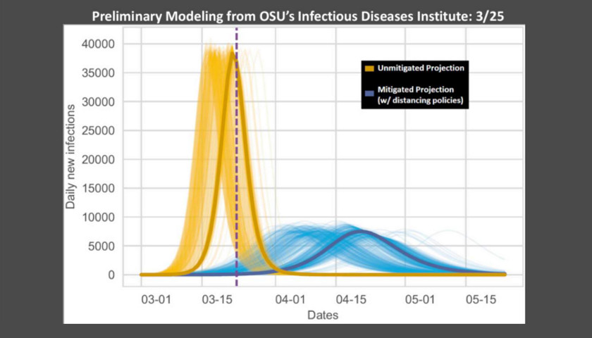
According to this model, if Ohio had not issued any measures, the number of daily cases would have been up to 40,000 (in yellow) by mid-March. However, since action occurred, the graph projected between 5,000 and 10,000 (in blue) daily cases.
When Acton unveiled this model, no information about who worked on these models was shown on the slide.
According to its website, Mike Oglesbee, DVM (Doctor of Veterinary Medicine), PhD is executive director of OSU’s Institute of Infectious Diseases
The website provides no information about the Institute’s modeling Coronavirus efforts or who from the Institute was involved in those efforts.
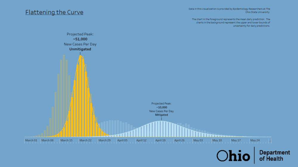
Two days later, the “Flattening the Curve” projection got a whole new makeover and showed different numbers than the original curve. This curve showed that if Ohio had not done anything, the state would have seen 51,000 cases by the middle of March.
“There’s a shadow here that shows every move we have taken has moved the model, and we’re really trying to slow this and steady it. On this y-axis curve, we have our cases per day. I know this startled people to say, yesterday, and our model is now showing that at the peak of this curve, we’re now projecting that we may see as many as 10,000 new cases per day,” Acton said during March 27’s press conference. The chart shows that the blue line reaches a point labeled Projected Peak–10,000 New Cases Per Day–Mitigated on April 19.
On this slide, it said, “Data in this visualization is provided by Epidemiology Researchers at the Ohio State University.”
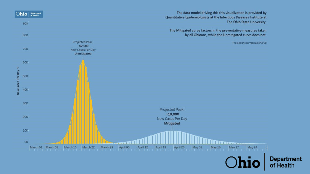
On Monday, the ODH made another update to the “Flattening the Curve” slide, which showed the number of projected cases (in yellow) to go up to 62,000 cases if the state had not implemented a “Stay-at-Home” order. The blue line still shows 10,000 new cases per day, but it is pushed back a couple of days after April 19.
On this slide, it says “The data model driving this visualization is provided by Quantitative Epidemiologists at the Infections Disease Institute at The Ohio State University.” These projections are current as of March 28.
This slide has been used throughout the week at press conferences. It must be noted the data has changed as more information has been gathered by ODH about COVID-19 testing.
Currently, ODH numbers show Ohio has 3,312 and 91 deaths from coronavirus.
– – –
Zachery Schmidt is the digital editor of Star News Digital Media. If you have any tips, email Zachery at [email protected].